The visual identity of a logo can make or break a brand in the eyes of a discerning consumer. Throughout a single company's history, various logos serve as indicators of values, loyalty, and togetherness.
10. Google
Year Company Founded: 1998
Year Logo Introduced: 1998
Company Founders: Larry Page, Sergey Brin
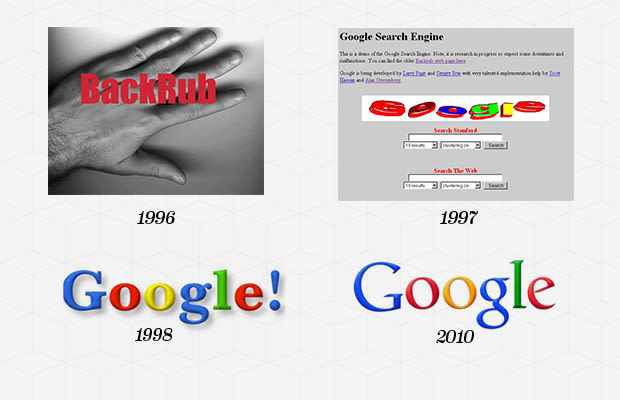
he Google logo was first envisioned in 1988 by Sergey Brin, one of the the founders of the company, using the graphics program GIMP. It was an unpolished rendition of the now iconic logo, with an added exclamation mark meant to mimic the Yahoo! logo. Introduced in 1999, Ruth Kedar's polished Google logo (with no exclamation mark) stayed in use by the company until 2010. Kedar's logo gained instant recognizability over the 11 years it was in use, making it one of the most iconic logos of all time. On May 6, 2010, Google launched its latest, updated logo featuring a slightly more orange "O" with more subtle shadows, but the end result did not stray far from Ruth Kedar's original design
9. Burger King
Year Company Founded: 1954 Year Logo Introduced: 1954 Logo Designer: Sterling Brands (1998) Company Founders: James McLamore, David R. Edgerton
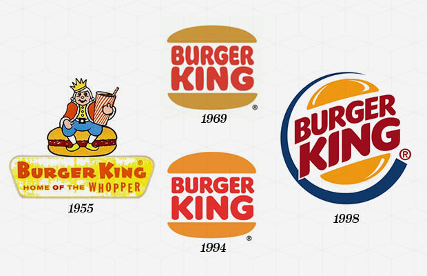
As the second largest hamburger fast food chain in the world, the Burger King logo has developed a recognizability second only to that of the McDonald's "Golden Arch." Starting with a simple logotype of "Burger King" in 1954, the company introduced the complex logo of the Burger King character sitting atop a burger the following year. The character of the King remains in use to this day in the brand's advertising, though the logo faced a monumental evolution in 1969 with the introduction of the "Bun Halves" design. Now instantly recongnizable, the Bun Halves design of 1969 remains a key element in the Burger King brand image. Going through two updates in the 1990s, the "Bun Halves" logo of 1998 incorporated an encompassing blue ring and added dimensionality to the one still used by the brand today.
8. Levi's
Year Company Founded: 1850 Year Logo Introduced: 1890's Logo Designer: Landor Associates (1967, 1969) Company Founder: Levi Strauss
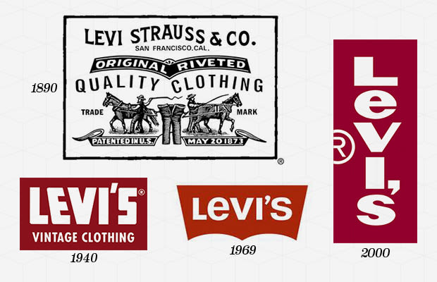
The Levi's logo today exists in two forms: the simple white logotype on a red background and the Two Horses logo, which dates back to the foundation of the company in 1886. The Two Horses logo is, to this day, used on the patches of Levi's jeans, in its original form, which was supposed to demonstrate the strength of Levi's jeans. However, the now equally iconic red label of Levi's came to be only in 1936, when the brand tried to distinguish their jeans. In 1967, Levi's introduced the Batwing logo, which was designed by Walter Landor & Associates, and has, over the years, become symbolic of the brand itself. 2011, Levi's removed the white brand name from the red logo of their Curve ID line.
7. McDonald's
Year Company Founded: 1940 Year Logo Introduced: 1940 Logo Designer: Jim Schindler (1962) Company Founders: Richard McDoland, Maurice McDonald
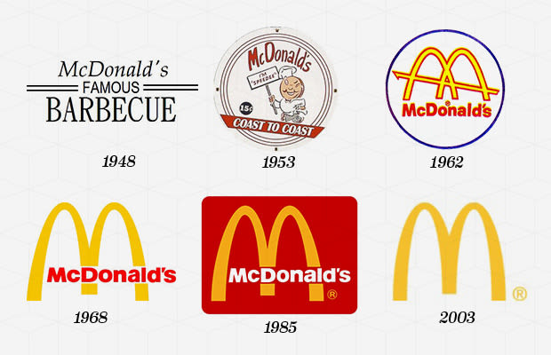
When McDonald's first emerged, the company was known as "McDonald's Famous Barbeque," hence the 1940 logo that fittingly featured the name of the company with two parallel lines emphasizing the "Famous." In 1948, the company was renamed "McDonald's Famous Hamburgers," and from 1948 to 1953, the company logo featured a slightly creepy animation of a cook. In 1953, McDonald's introduced Speedee as the mascot for the franchise, and he remained until 1960 when the Golden Arches were born. Stanley Meston, the man behind the Golden Arches, drew on the architecture of the McDonald's restaurants at the time for his design of the two arches forming an "M" with a dash cutting across.
In 1968, the company simplified the "M" and turned the "McDonald's" logotype black, creating an almost Halloween-like color scheme, which would stay in use until 1983. In 1983, the logo was transformed into what is now associated with the world's largest chain of hamburger fast food restaurants. Atop a red background, the logotype became white, and the arches went back to being golden. In 2003, "i'm lovin' it' was added below the golden "M," a slogan that was translated into various languages and went on to be splattered all over the company's packaging and restaurants. Part of a "Forever Young" redesign in 2006, McDonalds introduced its most simplified logo of all time, a plain and iconic golden "M" that suffices as a symbol for the company world-wide to present day.
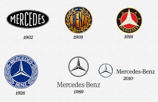
6. Mercedes-Benz
Year Company Founded: 1926 Year Logo Introduced: 1902 Logo Designer: Gottlieb Daimler (1909), Henrion Ludlow Schmidt (1989) Company Founders: Karl Benz, Gottlieb Daimler
The original DMG (Daimler Motors Corporation) logo, introduced in 1902, did not feature the now iconic three-pointed star, but was a logotype of "Mercedes" in an oval. Mercedes was a product name selected by DMG, inspired by founder Gottlieb Daimler's daughter's name. Seven years later, in 1909, Daimler, registered a three-pointed and a four-pointed star as trademarks of the company. Of course, it was the three-pointed star that was selected as a symbol for Daimler's ambitions for motorization "on land, on water, and in the air," and from 1910 on, every DMG car had a 3D three-pointed star adorning its radiator. In 1916, the three-pointed star became surrounded by a ring, bringing together the current Mercedes-Benz logo concept. Nonetheless, from 1916 to 1921, the logo featured an inner ring, which encompassed the logotype "Mercedes." The now iconic sleek silver star, with a simple ring surrounding its tips, was introduced in 1921, only to be replaced with a design reminiscent of the 1916 design. In 1926, following the merger of DMG and Benz & Cie. to create the modern day Mercedes-Benz brand, the new company introduced a logo which was a morphing of the two companies' logos. The 1926 design incorporated the DMG three-pointed star and the laurel wreath of the Benz logo. The words "Mercedes" and "Benz" were placed around the inner circle, which now encompassed the star. Mercedes-Benz stayed with the 1926 logo until 1996 when they returned to the sleek and simplified DMG design of 1921, bringing the company to its current iconic logo.
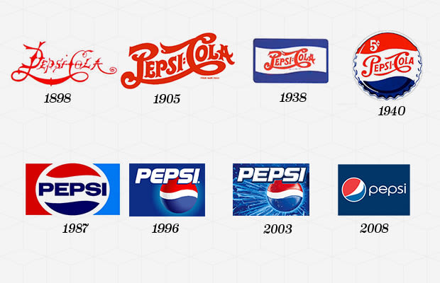
5. Pepsi
Year Company Founded: 1893 Year Logo Introduced: 1898 Logo Designer: Gould & Associates (1967), Landor Associates (1996), Arnell (2008) Company Founder: Caleb Bradham
Caleb Bradham, the founder of the company, scribbled a design which would become the logo for the company. The design was changed only slightly until 1962 when the word "cola" was dropped, and it just became Pepsi. The logo was a bolded "Pepsi" with a red, white, and blue bottle cap in the background. The logo was modernized 5 times from 1971 to 2005, each time becoming more sleek and defined.
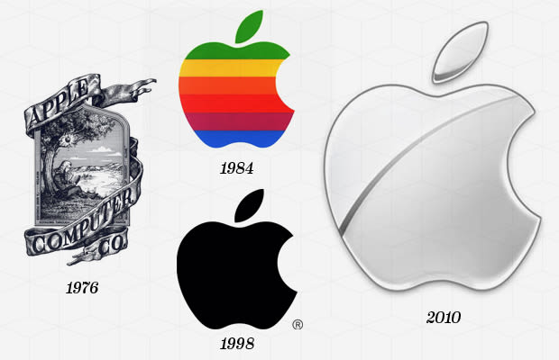
4. Apple
Year Company Founded: 1976 Year Logo Introduced: 1976 Logo Designers: Ronald Wayne (1976), Rob Janoff (1977), Landor Associates (1984), Apple (1998, 1998-2007) Company Founders: Steve Jobs, Steve Wozniak, Ronald Wayne
The Apple logo began with an intricate design by co-founder, Ronald Wayne, and was inspired by Isaac Newton's discovery of gravity, incorporating the Wordsworth quote, "Newton..a mind forever voyaging through strange seas of thought...alone," and featuring the words "Apple Computer Co." Instructed by Steve Jobs to replace the complex design with something not "too cute," Rob Janoff created the 1977 logo featuring a rainbow-striped apple illustration and the word "apple." It was supposed to appeal to young people and highlight the computer's unique ability to reproduce colors. The 1977 logo also featured the now iconic "bite" taken out of the apple, which was supposed to distinguish the illustration from a cherry.
In 1984, coinciding with the release of the Apple Macintosh, the company decided to simplify the logo to the lone apple, thinking it iconic enough without the accompanying word. Since 1984, the company has tweaked the design of the Apple logo, modifying colors and shading, though it has never steered away from the now distinctive symbol of the company.
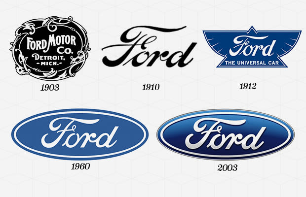
3. Ford
Year Company Founded: 1903 Year Logo Introduced: 1903 Logo Designer: Childe Harold Wills (1907) Company Founder: Henry Ford
Ford Motor company was actually Henry Ford's third automobile company. The first went bankrupt, and he left the second, which went on to become Cadillac. The original logo for the Ford Motor Co. was an embellished circle with the location and name of the company. It was changed to the famous blue oval in 1927 with the release of the Model A.
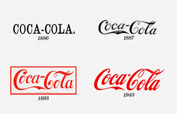
2. Coca-Cola
Year Company Founded: 1886 Year Logo Introduced: 1886 Logo Designer: Frank Mason Robinson (1887), Lippincott & Margulies (1968), Desgrippes Gobe & Associates (1998), Turner Duckworth (2009), Company Founder: John Pemberton
The Coca-Cola logo was created by Frank Mason Robinson, John Pemberton's bookkeeper, in the Spencerian script typeface, which was the principal style of formal handwriting at the time. In 1890, the company re-designed the logo to be more complex, featuring swirls and what appear to be cherries hanging from the "Cs" of "Coca-Cola". Of course, the logo did not stick, and we still see Frank Mason Robinson's design on every Coca-Cola product for what has become one of the world's most recognizable brands.
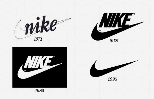
1. Nike
Year Company Founded: 1964 Year Logo Introduced: 1971 Logo Designer: Carolyn Davidson (1971), Nike (1978, 1985, 1995) Company Founders: Bill Bowerman, Philip Knight
First founded as Blue Ribbon Sports, an import company, Nike did not come into existence until 1971, when the company expanded into the production of their own sports footwear. The now iconic Nike "Swoosh" was selected half-heartedly by co-founder Philip Knight who said "I don't love it, but it will grow on me."
Carolyn Davidson, who at the time received only $35 for her work, was inspired by Nike, the namesake Greek goddess of victory, to create the Swoosh which implied movement and speed. Updating the logo in 1978, Nike opted for a bolder, all-caps font and a slight re-positioning of the Swoosh. The Swoosh went on to become one of the most iconic images in the world, so much that in 1995 the company chose to remove the brand name of the original design, leaving the Swoosh as the sole symbol of the company.
This comment has been removed by the author.
ReplyDeleteMy spouse and i ended up being thankful by reading this blog. Thanks friend.The illustrations you made, the straightforward blog menu, the relationships your site help to read easily for your readers. Thanks for all! Regrads, cash for cars adelaide
ReplyDeleteSimply desire to say your article is as astonishing. The clarity in your post is just cool and i could assume you are an expert on this subject. Well with your permission let me to grab your feed to keep updated with forthcoming post. Thanks a million and follow car removal brisbane.
ReplyDeleteThis comment has been removed by the author.
ReplyDeleteJunk Car Removals is the best Cash For Cars Brisbane Up To $12000 With Free Car Removal Brisbane, Get Top Cash For Junk Cars, Vans, Suv, Truck in Brisbane, Gold Coast, Ipswich, Logan, Caboolture, Sunshine Coast, Inner Brisbane, South Brisbane, North Brisbane, West Brisbane and East Brisbane
ReplyDeleteCash For Cars Brisbane
Visit Website
Thanks a lot for sharing this wonderful info! I am looking forward to seeing more posts by you as soon as possible. To more about sydney wide car removals visit us at Sydney Car Removal
ReplyDeleteThanks for sharing such a useful blog post. To know more details about car removals in Sydney visit us at Cash For Car Sydney
ReplyDeleteGreat post. I used to be checking constantly this weblog and I am inspired! Extremely useful information specially the ultimate part :) I maintain such info much. I used to be seeking this particular information for a very lengthy time. To know more about us visit here
ReplyDeleteThe tutorial is very helpful for a first timer like me, by the way if you could have given a tutorial on creating a free website, it would have been very helpful for newbies like me. Visit my website for sell your unwanted cars for top dollars.
ReplyDeleteI am extremely impressed with your writing skills. Great article and right to the point. Also take a look at our website for top cash offers for your junk cars.
ReplyDeletePositive site, where did u come up with the information on this posting? I have read a few of the articles on your website now, and I really like your style. Thanks a million and please keep up the effective work. To know more about cash for scrap cars visit my site.
ReplyDeleteThis article is to an undeniable degree unmistakable and what's essentially more especially lighting up. I have known key things here. I need to thank you for this basic read.
ReplyDeletehttps://japaneseautospares.com.au/ offers top dollars for your unwanted vehicles.